My Take On: Colors of the year for 2025
10/10/20243 min read
It is that time of the year where paint companies are revealing their color of the year for 2025. Valspar's color of the year for 2025 is Encore, which is a very bold navy blue. It's a great color for statement walls, doors and as an accent color however, I haven't been asked for this hue or depth in a blue in a long time. While I am excited to see what others paint with Encore, I just don't see it as a color that many will use due to its very bold and dark tone. However, it would pair nicely with a creamy white, like Bistro White from Valspar to lighten up the space while still letting Encore be the focus. It would also pair nicely with copper tones, darker blues, and orange toned browns.
What do you think about Encore?

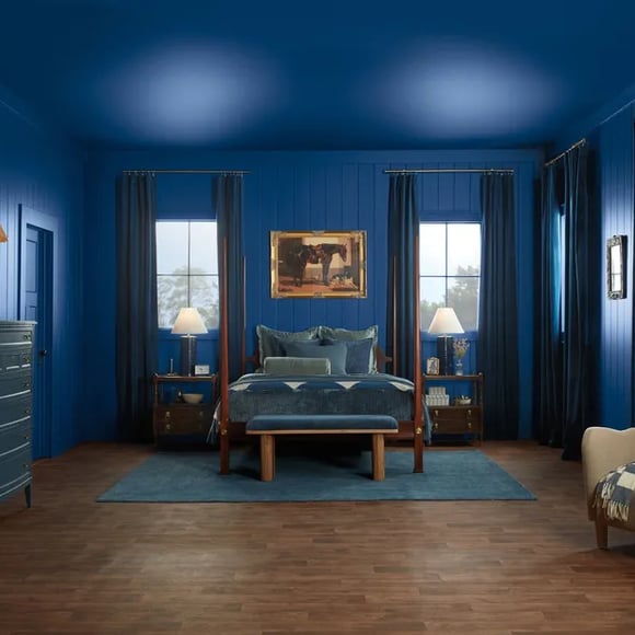
Images credit: Valspar
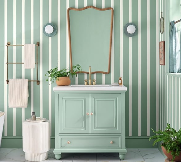
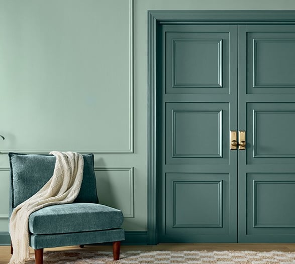
Sherwin Williams' color of the year for 2025 is Quietude, which is a cool blue/green that leans into a light-medium depth. It is great for those looking for a greenish-blue that leans more green than blue. It's ideal for just about any room in your house, as it brings a great pop of color into a space without making a space dark or moody. I personally believe that Quietude would look amazing in a laundry room or a bathroom (with great lighting of course) due to its relaxing and clean feel. If you're going for a beachy or coastal look, consider sampling Quietude as it has great tranquil and beachy vibes. It's also a phenomenal door color if your body/trim range into the light or dark gray tones.
Quietude is such an easy color to work with, since it's has a light-medium depth. It can be a focal point, if you add lighter colors such as Window Pane SW 6210 (A lighter green/blue that also leans greener) and Westhighland White SW 7566, which is a creamy off-white. However, Quietude can also a be a complimentary color for the darker blues, the cool yellows and even the gray browns.
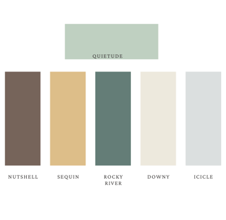
Below are SW swatches I put together of some complimentary colors for those wanting to integrate Quietude into their space or project.

Images credit: Sherwin Williams
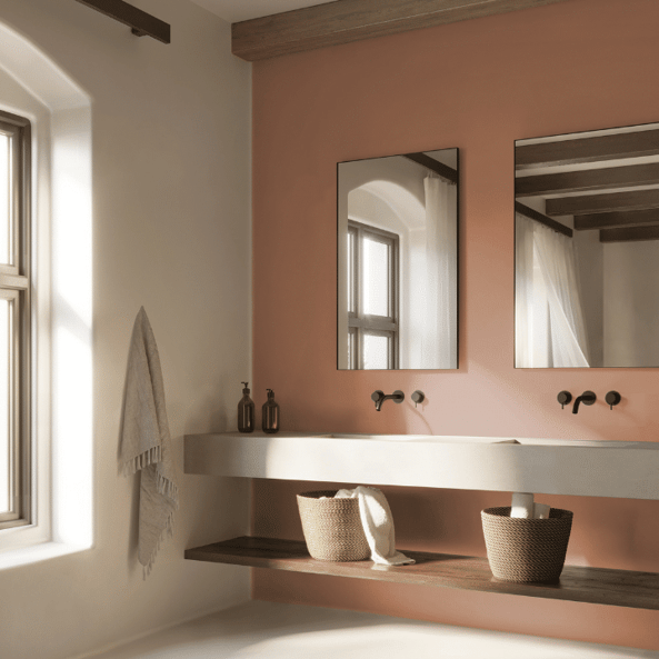
Dunn Edwards' color of the year for 2025 is Caramelized DET 687. It is a warm terracotta brown that has a medium--medium-deep depth. It is a very earthy, organic and nostalgic color. It is a historic color and while many want to get away from that outdated or darker terracotta look, I believe that in communal spaces Caramelized would look delightful. Although this color would look pleasant in a well lit bathroom, as kitchen or bathroom cabinets and even a nursery, I also trust that Caramelized would absolutely thrive in a commercial exterior space alongside; forest greens, creamy whites, dark charcoal colors and dark espresso tones. If you are wanting to transform your space into a more vintage feel, this color is perfect for that as it has those orange undertones to create that sort of feel. However, if you're looking for a warm brown to modernize your space, this can be an exceptional color as it would look great on furniture against lighter colored walls.
In comparison to other Dunn Edwards' color of the years in the past, I definitely believe that this is the most versatile one yet. I am interested to see what people create with these warm terracotta browns that are trending at the moment. What do you think about Caramelized?
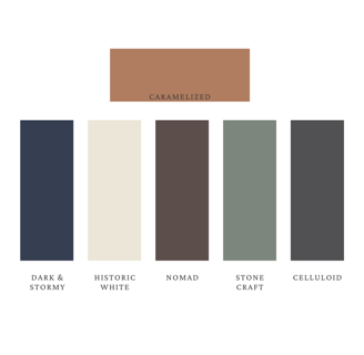
Below are some DE colors that I've put together that compliment Caramelized quite well:
Images credit: Dunn Edwards

Though there's other great colors of the year for 2025, the colors above caught my attention the most, each for different reasons. Let me know what you like or dislike. Were these colors predictable? What would you have liked to see instead?